Wednesday 19 July 2017

Trending Now: Color and Pattern Make These Backsplashes Stand Out

Trending Now: Color and Pattern Make These Backsplashes Stand Out

Jazz up a white kitchen or enhance a dark wood one with a bold backsplash. These 10 trending kitchen photos offer ideas


While the white kitchen seems to be a trend with staying power, we’ve noticed more homeowners choosing colorful tile backsplashes lately. That trend was evident in many of the most popular new kitchen photos added to Houzz from April through June, as measured by how many people saved them to their ideabooks during that period. Below are some of the standouts from new kitchen photos that made the top 40. Which backsplash style is your favorite?


Mosaic wall. A custom tile backsplash amps up the energy in this Seattle kitchen, which also features a chopping station. The first photo made the top 40 new kitchen photos; the second did not but shows a nice detail of the tile.


Party tile. Teardrop-shaped teal and white tiles evoke the bubbling top of a glass of Champagne in this Canadian kitchen backsplash. The inventive pattern is more lively than a full wall of the teal tiles would be. Also, fading to white as the backsplash goes higher gives the space a more airy, open feel.


Halfway up. This intricate backsplash in a kitchen in Moscow goes halfway up the wall — just the right amount so that the detailed pattern doesn’t overwhelm the eye. Capping the backsplash with a shelf adds to the kitchen’s storage and design.


Mezzanotte. This hand-painted ceramic tile brings an artisanal look to a traditional white kitchen. Geometric pottery and wooden salt and pepper containers underscore the handmade feel.


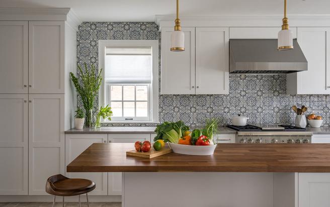
Here’s a pulled-back view of the backsplash against the surrounding white Shaker cabinetry. This photo was the fourth-most popular new kitchen photo added to Houzz from April through June of this year.


Happy pop. This kitchen features a neutral palette that gains visual interest from the sunflower-patterned mosaic tile, which adds an upbeat, energetic feel to the room.


A queen every day. This backsplash is a combination of geometric porcelain tile and wallpaper that features the likenesses of historic queens. The owner of this home — actually a houseboat in Sausalito, California, that belongs to an international lawyer — experimented with pattern and color for a truly unique floating residence.


Blue and sweet. This backsplash features hand-painted terra-cotta tile in cream with blue, black and rust accents, making for a unique color palette. This photo was the sixth-most popular new kitchen shot added to Houzz from April through June.


Here’s a detail shot of the same room.


Chevron. The designer of this kitchen, the fifth-most popular new kitchen photo on Houzz from April through June, used a chevron pattern for the backsplash. Chevron is made up of continuous V shapes and is a close cousin of herringbone, a pattern frequently seen on wood floors that has a broken, or staggered, V pattern.


Double duty. Here’s a backsplash option: If you’ve got a gorgeous countertop, why not just continue it up the walls? These Chicago homeowners matched up the quartzite grain pattern beneath the range hood — it looks like an upside-down V — in their transitional-style kitchen.


Textural white. Unlike the rest of the kitchens in this story, this Atlanta space features a monochromatic backsplash. But its texture and unusual convex shape give the wall added oomph.


Could this be an option for you?


Stop by our store or give us a call @ 905-892-5756 and we will provide a free estimate.

Wednesday 22 March 2017

Before and After: 6 Bathrooms That Said Goodbye to the Tub


Sleek showers replaced tub-shower combos in these bathroom remodels. Could this be an option for you?

Bathtubs, while a common bathroom feature, don’t always get a lot of use. Fifty-six percent of respondents say they never use their tub for taking a bath. So it’s no surprise that some people are opting to take out the tub altogether when they remodel their bathroom.

Let’s take a look at six bathroom transformations that said goodbye to the tub. Maybe these scenarios will shower you with new ideas for your own bathroom.


1. 1980s Style to Classic Charm
Bathroom at a Glance
Size: About 50 square feet (4.6 square meters)
BEFORE: A renovation in the 1980s left this bathroom dark and cramped.


AFTER: A large glass shower greets the homeowners, who chose a plan that would age along with them. They focused on adding a shower that allowed easy access should the couple have any mobility problems in the future, something their previous tub didn’t do.

Wall paint: Mt. Rainier Gray; wainscoting paint: Alabaster, both Benjamin Moore; toilet: Kohler; sink: Barclay; faucets:Pfister; mirrored medicine cabinet: custom; floor, subway and shower floor tile.


2. Crumbling to Crisp
Bathroom at a Glance
Who uses it: A couple expecting their first child
Size: ​About 55 square feet (5 square meters)
BEFORE: This 1912 bathroom had patched tile, limited storage and flickering fluorescent lights.


AFTER: The couple gets a bright, warm bathroom, complete with a large shower. (Note: A glass panel was added to create a side on the shower after this photo was taken.) The couple had fewer reservations about having only a shower in this space because the home has another bathroom with a tub.

Toilet: Adair, Kohler; paint: White Dove, Benjamin Moore; sink: Teorema; fixtures and knobs: Purist in brushed Moderne Gold, Kohler; cabinets: reclaimed sinker cypress, Kole Made


3. Floral Curtain to Elegant Glass
Bathroom at a Glance
Who lives here: A single professional woman who travels extensively for work
Size: 75 square feet (7 square meters)
BEFORE: The shower was tucked back into the corner of the space and was closed off from the rest of the room by a curtain.


AFTER: They changed the space into a shower stall. It opened up the space, making the bathroom feel larger, lighter and more airy. The shower covers about the same footprint as the previous shower but gives the room a whole different look.
Tile: Tile Showcase; shower wall and door glass: Starphire glass


4. Outdated to Efficient
Bathroom at a Glance
Who lives here: A family of three who regularly has guests
Size: 45 square feet (4.2 square meters)
BEFORE: When the owners purchased this condo, the bathroom had a mismatch of styles in the bathroom, as well as outdated electrical and ventilation.


AFTER: The renovated bathroom created a bathroom that efficiently uses space and requires little maintenance. One maintenance saver was the fixed-glass shower door. It also lets in additional light, along with the new window, to make the space brighter.


5. Unloved Pink to Cheerful Rainbow
Bathroom at a Glance
Who uses it: Artist and psychologist Jan Ferris and her standard poodle, King
Size: About 94 square feet (9 square meters)
BEFORE: Not only did the homeowner not love the color, but a recent leak that flooded her home had left black mold in the bathroom. The vanity also was jammed against the tub, making everything feel crowded.


AFTER: A large, glass-walled shower fills a corner of this artist’s now very colorful bathroom. The removal of the tub gave the homeowner more room, and she wasn’t concerned about the resale value of not having a tub.
Glass shower installation: Edden Glass and Mirror; mosaic tile: Sandstone mix


6. Clunky to Stylish
Bathroom at a Glance
Who lives here: A couple of newlyweds and the husband’s teenage son
Size: 75 square feet (6.9 square meters)
BEFORE: The bathroom was functional but felt clunky and didn’t match the family’s style.


AFTER: A walk-in shower, complete with a rain shower head and divider, brings an open, 1920s style to the family’s bathroom. chose the black trim to amp up the contrast in the room.


Could this be an option for you?

Stop by our store or give us a call @ 905-892-5756 and we will provide a free estimate.

Thursday 4 February 2016

Making Deck Mud (Dry Pack Mortar) for Tiled Shower Floors


Making Deck Mud (Dry Pack Mortar) for Tiled Shower Floors


Despite everything that’s been written on the proper way to make dry pack mortar, there still seems to be a great deal of uncertainty on the part of weekend warriors, and even a few pros have trouble with the concept. I have therefore taken a few pictures of the mud I make, and I will explain the process once again. Maybe these pictures will be a little clearer than those previously published. Included in this article are thumbnail photos, and if you click them you’ll be taken to the full-size versions.

To begin with, I’ll describe deck mud, which is also called dry pack mortar or floor mud. In other English speaking countries it might be called “screed.”


Deck mud is made with clean sand, portland cement and water. That’s it. Don’t consider adding anything else. The basic recipe is 5 parts sand to 1 part portland cement — 5:1. Some professionals prefer a richer mix of 4:1, but I’ve found that ratio hard to mix and spread. Too much cement and the mortar tends to clump as you mix it. Other pros advocate a 6:1 or even a 7:1 recipe. I think 5:1 can be considered the median of the industry. I think it’s ideal. Richer or leaner mixes do the job, though, so don’t panic if your mud is not “ideal.”

It has been suggested that deck mud should be mixed with latex additive instead of water, this to make the mortar more cohesive and to give it greater compressive strength. Well, I’m here to tell you that mortar made from sand, cement and water can easily attain a compressive strength of 3,000 psi or better. That strength is more than adequate for shower floors and other small areas. Adding latex in this instance is simply a waste of time and money.

The best sand to use is clean “sharp sand.” Sharp sand is crushed stone. It might also be called concrete sand or torpedo sand. It is much courser than masonry sand, but masonry sand can also be used.

Portland cement is the universal name for construction cement. It comes in 94 lb. sacks and is available at almost all building supply stores, many hardware stores, big box home centers and most sand yards. This is the cement to use for deck mud. Do not consider “masonry cement,” which contains lime.
 

There are pre-mixed mortar products that contain only sand and portland, and these can be used to make deck mud. Most of them will have to be thinned down just a bit by adding additional sand, as the cement content of the pre-mixes is too high (about 3:1, usually). One popular product is Sand Topping Mix. You can find Sand Topping Mix at Home Depot. I use it frequently for small jobs like single shower floors. I buy a couple 50-pound sacks of Play Sand, which can be added to the Sand Topping Mix to weaken it and make it more appropriate for shower floors.

The amount of water used in making deck mud will depend on the water content of the sand you use. If you are using a pre-mixed product like Sand Topping Mix the sand will be completely dry. Sharp sand or masonry sand, on the other hand, is stored outdoors, and its water content varies with the weather. In making deck mud you want to use only enough water to cause the cement coated sand particles to cling together when compressed in your hand. You will see no water when this occurs. The mix will merely be damp — just enough water to activate the cement and cause the hydration process to begin.


The mortar is made from 80 lbs. of Sand Topping Mix to which 50 lbs. of Play Sand
have been added. Water was added in small amounts until the mortar was dampened completely.

Whether using a pre-mixed product or sand and portland cement, it is important to dry mix the mortar before adding water. This ensures that each particle of sand becomes coated with cement. You can use a shovel, but a masonry hoe (above) works much better. A flat sand and gravel shovel works well when mixing on a flat surface such as a concrete slab or sheets of plywood. The idea is to shift the material back and forth until it’s completely blended.

Water is added only to the point that the mortar becomes evenly damp. You can see above the clumps that are created when water combines with the sand and cement. Continuing to mix the mortar will eliminate much of the clumping — unless the cement content is too rich.


The mortar is mixed. Note how it holds it’s shape when clumped in the hand. Note also that
there is no excess water. Look how relatively clean my hand remains after clumping the mud.
Handling the mud can be equated to making sandcastles, except that the mud will be a bit
dryer than sandcastle material.

The deck mud depicted above is ready to place and form. It is damp enough to hold itself together when packed but at the same time it contains no excess water. Water is what causes concrete and concrete products to shrink when curing. Deck mud is used because it shrinks very little. It is also much easier to work than mortars which contain more water, such as brick mortar, for example.


In this picture I have crushed the clump with my thumb. You can see how easily
the mortar crumbles. You can also easily see how dry the mix is. It’s unlike any other mortar
you might be familiar with.

When you pack the deck mud in your shower floor you will be able to rake it into the shape you want by using short pieces of wood as straightedges. That’s pretty much how shower floors are formed. The mortar is packed in with a wood float or flat steel trowel and rubbed or scraped off until the dish shape of the shower floor is attained. I’ve written books that contain instruction for building showers, and others have written articles on the subject, so I won’t cover that exercise here. This piece is intended only to give you a close-up look at properly mixed deck mud and a “feel” for how the material should act when you place it. I will say this, though. Don’t dilly dally around once the mud is mixed. Depending on temperature, humidity and wind conditions, you’ll have from 30 to 45 minutes to get the mud placed and shaped. Take longer than that and you’re pushing your luck.

To recap, deck mud is the mortar to use when building shower floors. Don’t let anyone tell you otherwise or sell you other cement products. Deck mud contains only sand, portland cement and a little bit of water.


Next time we will talk Waterproofing. 

Stop by our store or give us a call @ 905-892-5756 and we will provide a free estimate.

Wednesday 13 January 2016

Six Elements of an Effective Kitchen Office -

Six Elements of an Effective Kitchen Office -


With kitchens being the hub of the home today, they often require a spot for keeping the household organized. We need a place to sort our mail, charge our devices, stash cookbooks, plan menus, keep track of schedules, pay bills and more.
But sometimes there’s enough room in the kitchen only for a mini-office. Here are six key features of a successful kitchen workspace.


1. Is located out of the kitchen work zone. Whether you’ve set up the popular work triangle or work zones, you’ll need the kitchen office to be close yet out of the way.

The far corners of the room are good locations.


So are spots nestled just beyond the main kitchen work area, such as bays or nooks like this. The main part of this kitchen is to the right of this workspace. Cherry provides contrast to the white cabinetry in the rest of the kitchen.


This wall-mounted desk is still part of the kitchen but is tucked just beyond the cabinetry and work zones. The desk is simply a stone top and floating drawer held up by steel brackets.


If space is tight, consider incorporating a secretary desk in your cabinetry. The work surface folds up to hide your mess. For a solution like this, place the desk at a height that will work with your counter stools or kitchen chairs, so you can just drag one over when it’s time to get to work.


2. Has places for corralling and charging electronics. One thing many of us didn’t have to consider during our last kitchen renovation was the personal devices that seem to need an endless supply of wires and juice. Phones, tablets, laptops and their wires can quickly take over your outlets and counters. Cooking and delicate electronic equipment are a terrible mix. Providing room above this desk keeps things out of the way in this kitchen.

Another lovely detail worth noting is the waterfall counter that extends across the desktop and down to the floor. This picks up on a similar detail on the kitchen island in the same room.


Locating outlets above the desk surface makes it easier to plug in everything you’ll need. If those outlets have built-in USB ports, you’ll eliminate the need to keep track of the charge boxes that contain plugs and USB ports.


Also, electricians can install outlets inside drawers, so you can keep your devices safely inside while they charge.


If your kitchen desk serves as your sole home office space, you won’t want printers, scanners and fax machines junking it up. An appliance garage is a good solution for keeping these things handy yet hidden.


The rolling door typically seen on appliance garages is called a tambour door and is readily available at home improvement stores.


3. Includes ample storage space. If you do a lot of paperwork at your kitchen desk, you’ll need good spots to tuck it away. If you’re a filer, file cabinets can be customized to fit seamlessly with your kitchen cabinets. If you’re a piler, baskets and shelves inside other cabinets can keep your piles organized.


4. Provides an organizational pit stop. If your kitchen desk area serves as your home’s command central, you’ll need to keep track of invitations, bills, business cards, appointments and more. A corkboard is a great place to pin it all until you have time to pay the bill, add an event to the calendar or create that new contact listing.


This kitchen desk has a bit of everything for communication: custom corkboard, chalkboard, dry-erase board and calendar.


5. Includes shelves for cookbooks. Kitchen desk areas are a great place to pick recipes and plan menus. Keeping cookbooks and recipes handy in the kitchen is something we’ve always done, but it usually involved letting them hog valuable counter space or shoving them willy-nilly in cabinets designed for china. Today’s designers know to size up a cookbook collection and plan shelves accordingly, and the desk area is just the right spot.


This extended kitchen desk incorporates plenty of space for cookbooks on the desktop, wall-mounted shelves and lower shelves.


6. Is well-lighted. Don’t count on your kitchen’s overhead lights for proper reading light. Here, undercabinet lighting keeps the desk space clear and illuminates the entire area.


If you have the space, a task lamp or table lamp can add an interesting layer of light to your kitchen. This is the light to leave on during movie night, so you can get a snack without having to flip on the overhead lights in your kitchen.


Stop by our store or give us a call @ 905-892-5756 and we will provide a free estimate.

Wednesday 30 December 2015

Kitchen Confidential: 9 Trends to Watch for in 2016

Kitchen Confidential: 9 Trends to Watch for in 2016


If you’re anticipating next year’s hottest kitchen trends, we’re right there with you. So what might the quintessential 2016 kitchen look like? We asked two interior designers for a sneak peek at what’s to come. Hi-tech workstations, ’80s glam and muted color schemes are just a few of the looks they say will lead the pack. Without further ado, here are nine trends they predict will define kitchen design in the new year.


1. Soft, muted color palettes. Good news if you’re already thinking about switching up your color scheme: Kitchen colors are changing, according to interior designer Jane Lockhart. Though white motifs will still dominate, everything from cabinets to backsplashes will be done in less saturated tones. “Charcoal, grays and even neutral pastels like pale blue, pale green gray and tinted whites are the new alternative to the standard white,” she says. She also foresees kitchens sporting lighter wood tones, including walnuts, whitewashed woods and white oak in rift grain.

Bold primary colors, on the other hand, will be placed on the back burner. Interior designer Gail Drury says they’re definitely out as accent colors. “Drier colors will become popular,” she says. “Muted blues and greens and pale yellow pastel will be used as accent colors.”


2. Smart spaces. Get ready for a hi-tech makeover. Both Lockhart and Drury predict more kitchens will have designated spots for smart devices next year. “Look for areas with hidden charging stations to store devices like phones and tablets so that they are always operable, at hand and charged,” Lockhart says. 


3. An ’80s reboot. “The ’80s are back,” Lockhart says. Mirrored backsplashes, brass accessories and high-gloss surfaces aren’t dead by a long shot, but they’re more elegant and refined this time around. “An elegance not seen in the ’80s will be an incorporation of a variety of natural materials to remove the ‘plastic’ look of that great hair decade,” Lockhart says. Drury adds that homeowners will opt for brass with satin rather than shiny finishes.


4. Metal range hoods. One of last year’s biggest trends was metallic finishes, be it copper, brass or bronze. However, homeowners went with small helpings of metal, primarily using faucets, pendant lights and cabinet pulls to incorporate this raw texture.

In 2016, metal will assume a more dominant role in kitchen aesthetics and trump wood as the range hood of choice. “Wood mantle hoods are being replaced with metal hoods or ones that are a combination of wood and metal,” Drury says. If you’re planning to follow suit with next year’s fixation on neutral color tones, a metal hood can introduce a burst of contrast into your kitchen.


5. Integrated kitchen-living spaces. Maybe your kitchen feels disconnected from the rest of your home. Maybe you want your cooking space to feel more accommodating. Either way, this trend could be for you. Lockhart anticipates more streamlined kitchen designs in which the kitchen converges with the home’s primary living space. “It will become part of the main living space even further,” she says. Designers will merge kitchens and living rooms by including hidden and integrated appliances.


6. A new kind of tradition. While it’s no surprise that present-day kitchens are embracing simple design, Lockhart expects traditional spaces to hop on board too. “Even traditional kitchens may experience a slightly cleaner feel with bold lines and less fussy details,” she says.

But Lockhart says it isn’t the end of traditional design as we know it. It just means homeowners will opt for fewer frills and more calculated, strategically placed details. “Traditional designs will always remain popular, but future renditions will be more deliberate with an emphasis on key elements like hoods, islands, cabinet crowns and so on,” she says.


 7. Texture-on-texture contrast. It’s time to reimagine contrast in 2016. Drury says variations in texture will rule, rather than traditional methods of contrast. “Strong contrasting designs are being replaced with more texture-on-texture designs,” she says.

It won’t be about mixing and matching textures, though. Instead, designers will reposition the same texture in different patterns throughout the kitchen. “The same exact stone can be finished three ways and combined in the same space,” Drury says. “The difference is very subtle but at the same time makes a statement about attention to detail.”


8. A nod to midcentury mod. Lockhart credits this trend to the popularity of midcentury modern furniture and says the period design will trickle down to kitchens. “To some extent, this is already occurring with the increasing use of walnut in islands and cabinet doors,” she says. “But look for more kitchen styles that offer a nod to ’60s modern style, also called Nordic style.” You can get in on this minimalist movement by choosing predominantly white color palettes, designing with light wood textures and clearing away unnecessary clutter. Nordic design is all about simplicity and functionality.


And remember when appliances were clad in color? That midcentury trend is making a comeback too. “Colored sinks, backsplashes and accent cabinets are all items with stronger hues that were previously considered to be neutral elements,” Lockhart says. “Even appliances like slide-in stoves and countertop appliances are taking on color to add a more modern feel with pops of energy throughout the space.”


9. Well-lit cabinetry. Homeowners won’t settle for just ceiling lights and table lamps to illuminate their kitchens. The two designers say extensive cabinet lighting is a trend to watch. “Low-voltage light tape strips are used as accent pieces below cabinets, above cabinets, inside cabinets and below countertop overhangs,” Drury says. “LED lights are the norm.” These features will be grouped with recessed can lights to offer better mood-setting capabilities.


Stop by our store or give us a call @ 905-892-5756 and we will provide a free estimate.